最近被人提醒才想起我以前有寫這個blog🙂↔️
來更新一篇,最近都在研究iOS26的UI元件變化
我覺得apple自己很需要出一個各版本UI的對照表吧,每次都不聲不響地更新,沒有地方可以查。設計/QA也常常因為不一致的情況或是不知道那是原生元件,想要去調整長相而開單。
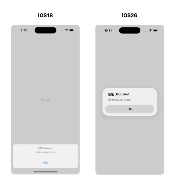
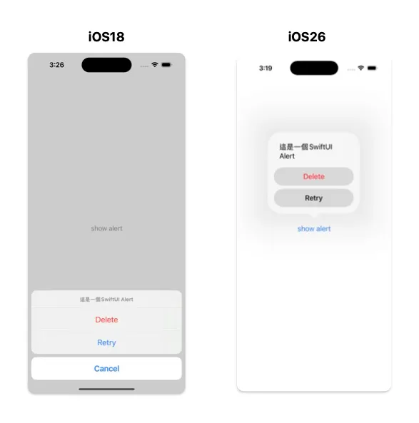
UIAlertController UI變化
style: alert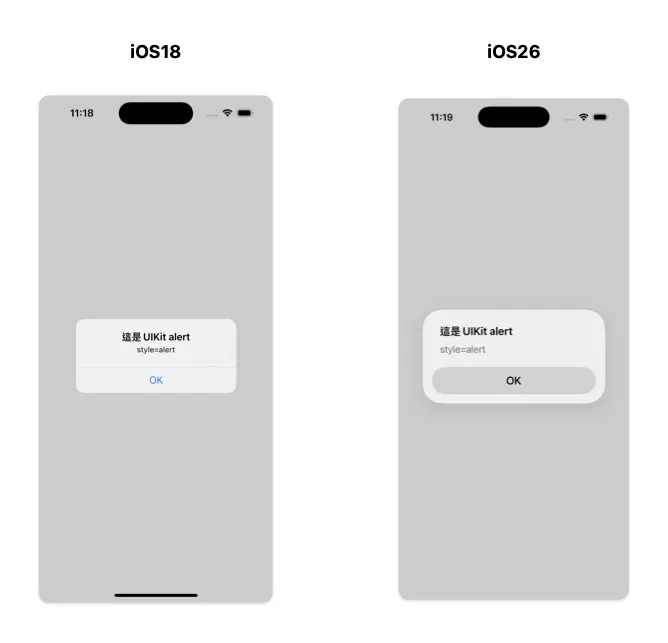
style: actionsheet
ios18是底部彈窗,ios26變成置中,跟alert樣式一模一樣
所以ios26沒有底部彈窗樣式了⚠️🙂↔️設計稿也不要再畫這種了
加了popover可以浮在呼叫的元件上面
if let popover = alert.popoverPresentationController {
    popover.sourceItem = sender
}

SwiftUI-confirmationDialog
可以達成一樣的效果
UINavigationBar+UIBarButtonItem
單個barItem
iOS26 直接使用UIBarButtonItem,字會框起來變成一個橢圓形的圈圈
let rightBarItem = UIBarButtonItem(title: "編輯", style: .plain, target: self, actionself.navigationItem.
: nil)
self.navigationItem.rightBarButtonItem = rightBarItem

但是如果用UIBarButtonItem的customView包UIButton的話,框框會變成圓形的(為什麼要有這種奇怪的分別?_?)
let rightBarItem = UIButton()
rightBarItem.setTitle("編輯", for: .normal)
rightBarItem.setTitleColor(.black, for: .normal)
self.navigationItem.rightBarButtonItem = UIBarButtonItem(customView: rightBarItem)

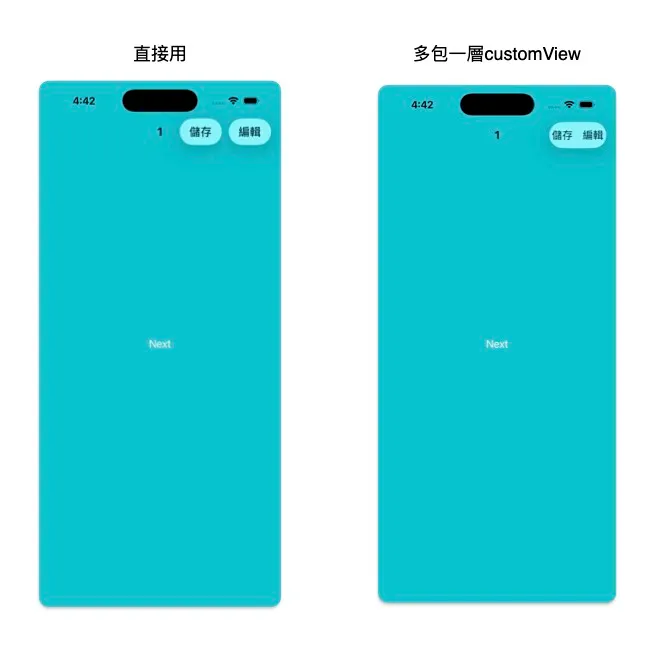
多個barItems
直接用會幫你一個一個框起來,多包了一層customView會幫你group
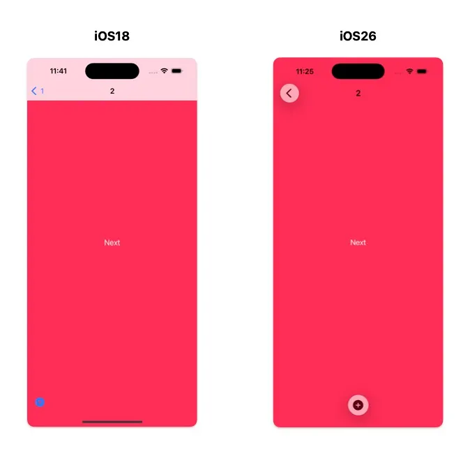
底部UIToolbar UI變化
UIToolbar + UIBarButtonItem
ios18位置預設置左,ios26預設置中
self.navigationController?.isToolbarHidden = false
let rightBarItem = UIBarButtonItem(image: .add, style: .plain, target: nil, action: nil)
setToolbarItems([rightBarItem], animated: true)
單個barItem
想要讓26回復置左,另外加個flexiblespace把它擠回去
let space = UIBarButtonItem(barButtonSystemItem: .flexibleSpace, target: nil, action: nil)
setToolbarItems([rightBarItem1, space], animated: true)

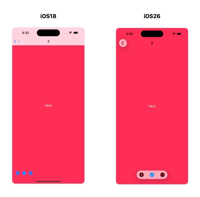
多個barItems
ios18也是從左邊開始排,ios26置中
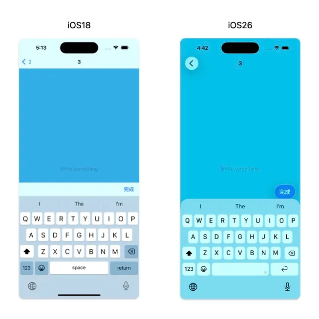
UITextField收鍵盤按鈕
UITextField + UIToolbar + done
以前的設計都會習慣在鍵盤上加一個done,打字完收鍵盤。在ios26 toolbar整條變透明的,然後barItem style = .done,會幫你藍底框起來
另一點是done在26被deprecated了,26之後要用.prominent,實測效果一樣

let textfield = UITextField()
let toolbar = UIToolbar()
let done = UIBarButtonItem(title: "完成", style: .done, target: self, action: #selector(doneTapped))
let flexSpace = UIBarButtonItem(barButtonSystemItem: .flexibleSpace, target: nil, action: nil)
toolbar.items = [flexSpace, done]
toolbar.sizeToFit()
textfield.inputAccessoryView = toolbar
style = .done
style = .plain
ios18還是長一樣,ios26是白底
由於整條toolbar背景變透明,飄一顆按鈕實在很怪,這邊就是要思考如何重新設計UI的地方了。參考官方的提醒事項App,單顆可以放在右上角navigationBar的Item,多顆group飄在keyboard上面。

當然我覺得最簡單就是加手勢,點一下頁面其他地方就收鍵盤,根本都不需要多的按鈕。
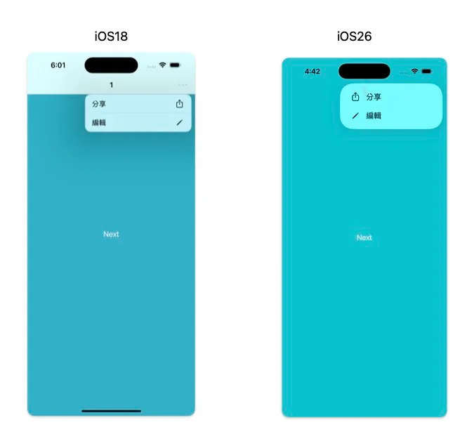
UIMenu
ios18字左圖右,ios26字右圖左,間距也變小了
這個是少數我覺得比較好看的改動
let share = UIAction(title: "分享", image: UIImage(systemName: "square.and.arrow.up")) { _ in
}
let edit = UIAction(title: "編輯", image: UIImage(systemName: "pencil")) { _ in
 }
let menu = UIMenu(options: [.displayInline], children: [share, edit])
rightBarItem2.menu = menu
其他還有一些minor change就沒有截圖了,例如:pickerView、trailingAction切圓角,tableview的insetGroup圓角角度改變、tabbar變圓角透明等
Apple 自己有出一個如何adopt到液態玻璃的文件,但比較像是如何設計新畫面guideline,一些微妙的UI差異就絕口不提
還是可以傳給自家的設計看看
Murmur:液態玻璃
雖然記錄了一整篇iOS26,但我還在iOS18🙂↔️
因為我是實用主義派,我覺得原本的Flat design(扁平化設計)耗電低又清楚明瞭,不懂為什麼要花多的電去運算玻璃效果跟光影,雖然有一說是因為vision pro的空間操作感apple要統一設計。但我是手機啊,載體不一樣為什麼設計要一樣
傳聞Apple 2027年將全面實施,讓我想說還是以後我去用android好了🤣