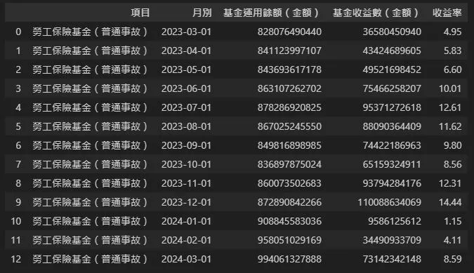
首先,這是我們的資料:
import pandas as pd

data = pd.read_excel("勞工保險基金每月經營概況.xlsx")
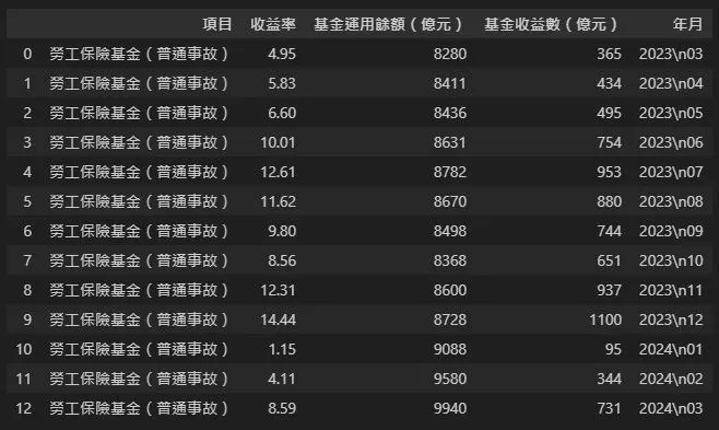
data["基金運用餘額(億元)"] = (data["基金運用餘額(金額)"]/100000000).astype("int")

data["基金收益數(億元)"] = (data["基金收益數(金額)"]/100000000).astype("int")

data["年月"] = list(map(lambda x: str(x)[0:4]+"\n"+str(x)[5:7],data["月別"]))

data.drop(columns=["月別","基金運用餘額(金額)","基金收益數(金額)"],inplace=True)
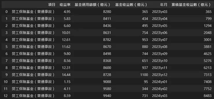
利用迴圈計算累積收益:
maonylist = []

x = 0
for i in data["基金收益數(億元)"]:
    x = i + x
    maonylist.append(x)

data["累積基金收益數(億元)"] = pd.Series(maonylist)
整理好資料,我們就可以來繪圖了:
import matplotlib
#設定中文字型
matplotlib.rc("font",family="Microsoft Yahei")
from matplotlib import pyplot as plt
#設定圖表大小
plt.figure(figsize=(12,6))
#設定子圖位置
ax = plt.subplot2grid((1,1),(0,0))
#設定x、y資料
ax_x = data["年月"]
ax_y1 = data["基金收益數(億元)"]
ax_y2 = data["累積基金收益數(億元)"]
ax_y3 = data["基金運用餘額(億元)"]
#區域圖(fill_between(x,y1,y2)):填充y1、y2間的面積
ax.fill_between(ax_x,ax_y3,0,label="基金運用餘額",color="darkgray",alpha=0.5)
ax.fill_between(ax_x,ax_y2,0,label="累積基金收益數",color="green",alpha=0.5)
ax.fill_between(ax_x,ax_y1,0,label="基金收益數",color="lightgreen",alpha=0.5)
#設定y軸參數
ax.set_ylim(0,10000)
ax.set_yticks([2500,5000,7500,10000,12500])
ax.set_yticklabels(["2千\n500億","5千億","7千\n500億","1兆","1兆\n2500億"])
#設定圖例
ax.legend(loc="upper left")
#設定文字
for a,b,c,d in zip(ax_x,ax_y1,ax_y2,ax_y3):
ax.text(a,b+150,str(b)+"億",horizontalalignment="center",color="lightgreen")
ax.text(a,c+150,str(c)+"億",horizontalalignment="center",color="green")
ax.text(a,d+150,str(d)+"億",horizontalalignment="center",color="darkgray")
#設定標題
ax.set_title("2023年3月至2024年3月\n勞工保險基金每月經營概況")